Soft Brutalism: Why LINKSPREED Finally Locked In Our Corporate Identity and UI System
LINKSPREED made its corporate identity and UI system final. This deep dive documents Soft Brutalism in full: hard black outlines, large soft corner radii, no shadows, and a strictly monochrome palette with a single accent color.
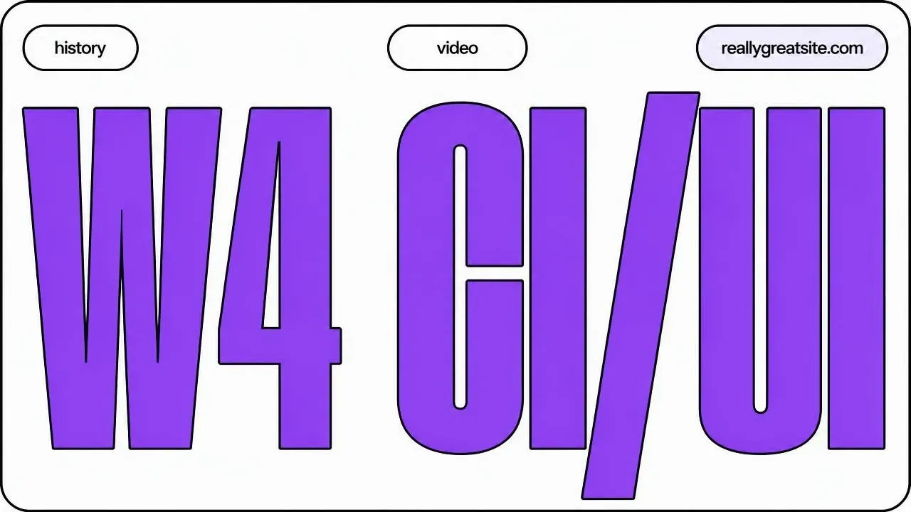
After years of iteration, experimentation, and more than a few redesigns we’d rather not talk about, we’ve made a decision at LINKSPREED that we don’t intend to revisit: our corporate identity and user interface language are final. We’re calling it Soft Brutalism, and this article documents the complete specification — not because we think everyone should copy it, but because we believe design systems should be public commitments rather than internal secrets.
The road to a final decision
Design systems at growing companies tend to accumulate rather than converge. That was certainly true for us. Over the past several years, LINKSPREED went through phases that many product teams will recognize: a soft, shadow-heavy period where every card floated above the page; a flat, minimal era where we removed so much visual structure that hierarchy collapsed; a colorful stretch where brand accents crept into fills, backgrounds, and body copy until the interface felt loud and undisciplined.
Each of those directions taught us something, and each one failed for the same underlying reason. They relied on ambient visual cues — shadows, gradients, tinted surfaces — to communicate structure. Ambient cues are fragile. They break in dark mode, they degrade on low-quality displays, they behave inconsistently across browsers, and they quietly drift apart between marketing pages and the product itself.
What we needed was a system where structure is explicit. Where a boundary is a boundary because there is a literal line drawn there, not because of a subtle luminance shift. That’s the core insight behind Soft Brutalism, and once we found it, everything else fell into place with unusual speed.
The core idea
Soft Brutalism is built on a deceptively simple pairing: hard black outlines combined with very large soft corner radii.
Brutalism in web design has traditionally meant harshness — raw edges, aggressive contrast, an almost hostile refusal of comfort. We kept the honesty and the structural clarity of that tradition, but we softened the geometry dramatically. The result is a system that feels confident and architectural without feeling cold.
The governing principles are these:
- Surfaces are separated only by border. Never by shadow. Never by background color. If two elements need to be distinguished from one another, a line does that work. This single rule eliminates an entire category of design ambiguity.
- Color is accent only. The carrier is always black and white. Our interface is fundamentally monochrome. Color appears as a deliberate, sparing signal — never as the structural foundation.
- Stay minimal. No unnecessary icons. No decorative components. If an element doesn’t carry meaning, it doesn’t ship.
- No shadows. Anywhere. Ever. We’ll return to this, because it’s the rule people break first.
Color
Our palette is intentionally narrow.
The base is white in light mode and a near-black #0A0A0A in dark mode. We deliberately avoided pure #000000 for dark surfaces — at full black, borders and text lose the subtle depth that makes long reading sessions comfortable.
Borders are black in light mode and white in dark mode. Pure values, always. This is non-negotiable and we’ll explain why shortly.
Text uses #1F1F1F for primary content and #6B7280 for secondary content, with the secondary tone lightened appropriately in dark mode to maintain the same perceptual relationship.
We permit exactly one accent color, and it must not be the same value across modes. Ours is violet: #7C3AED in light mode, #A78BFA in dark mode. The reasoning is straightforward — a saturated violet that reads as vivid against white becomes muddy and low-contrast against near-black. Using an identical hex value in both modes is a shortcut that always produces a worse result in one of them.
Critically, the accent has a restricted job description. It is permitted for hover states, kickers, focus rings, and occasionally a single highlighted word. It is forbidden for large fills and for body text. The moment an accent color starts filling regions, it stops being an accent and starts being a theme.
Beyond the brand accent, we maintain a small set of semantic colors, and these are strictly limited to icons and text — never strong fills:
| Color | Meaning |
|---|---|
| Blue | Informational |
| Green | Success |
| Purple | Security |
| Orange | Action |
| Red | Error |
Every semantic color must be validated in both light and dark mode. A green that reads clearly on white and disappears on near-black is not a usable semantic color.
Borders: the structural language
Because we’ve removed shadows entirely, borders carry the full weight of visual hierarchy. So we treat border width as a meaningful, encoded signal rather than a stylistic whim.
| Width | Purpose |
|---|---|
| 1px, faint | Dividers |
| 2px, solid | App chrome — headers, sidebars, menus |
| 3px, solid | Objects — cards, dialogs, inputs |
| 4px | Showpieces |
Once you internalize this scale, you can determine an element’s role in the hierarchy from its outline alone. A 2px line means “this is part of the application frame.” A 3px line means “this is a discrete object you can interact with.”
And one absolute rule: borders are always pure black or pure white. Never gray. Gray borders are the single most common way this system gets diluted. A gray border is a designer hedging — trying to get structure without commitment. It reads as unintentional, it fails contrast checks, and it makes the entire interface look tentative.
Radii: the “soft” in Soft Brutalism
Large corner radii are what keep the hard outlines from feeling aggressive. Our scale is proportional to component size:
| Radius | Used for |
|---|---|
| 12px | Small buttons |
| 16px | Inputs, lists |
| 24px | Menus |
| 32px | Dialogs |
| 40px | Cards |
| 48px | Large panels |
| Full-round | Pills and dots |
The underlying heuristic: radius should be roughly 12–18% of the shorter edge of the element. This is what makes the system scale gracefully. A radius that looks generous on a small button looks timid on a large panel, and a radius tuned for a panel looks like a blob on a button.
We cap the system at a maximum of five radius tokens in active use. Radius scales sprawl faster than almost any other design token, and an eight-value scale is indistinguishable from a five-value scale to users while being considerably harder to maintain.
Radii too small is a recurring failure mode. When corners tighten, the system stops reading as Soft Brutalism and starts reading as a generic bordered layout.
Shadows: none
This deserves its own section because it’s the rule that gets violated most often, usually with good intentions.
There is no box-shadow anywhere in our system. No exceptions. Not on hover. Not on dropdowns. Not “just a very subtle one” on modals.
Separation is achieved through border plus spacing — nothing else. If an element doesn’t feel sufficiently distinct, the answer is more padding or a heavier border, never a shadow.
This extends to interaction feedback. Button press states use scale(0,96). They do not use inset shadows, and they do not simulate depth through shading. A related trap: teams that remove shadows often leave the old press animations in place, producing buttons that appear to compress into a surface that no longer exists. Those leftover animations must be cleaned up.
Typography
Our type system uses one sans-serif family with a full weight range as the workhorse. We permit one optional display font, restricted exclusively to the wordmark, and one monospace family for technical content — code, identifiers, and system output.
The typographic personality comes from deliberate contrast between headings and body text:
Headings are huge, weight 900, tightly tracked, and uppercase. They’re meant to be structural — closer to architectural signage than editorial titling.
Labels are tiny, weight 900, widely tracked, and uppercase. The wide tracking is essential at small sizes; without it, heavy uppercase text becomes an unreadable dense block. Our hard floor: never set uppercase below 11px at weight 900.
Body text deliberately breaks the pattern. It runs weight 300, at a larger size of 18–20px, in gray, with relaxed line-height. This is the most important typographic decision in the entire system. If body text matched the heavy, tight, uppercase treatment of headings, the interface would be exhausting to read. The contrast between assertive headings and calm, generous body copy is what makes the system livable.
Body text stays mixed-case, always. All-uppercase everything is a signature failure of brutalist-influenced design — it looks striking in a screenshot and becomes illegible in actual use.
Spacing
We use a 4px-based grid: 4, 8, 12, 16, 24, 32, 40, 48, 64, and upward.
Generous padding and gaps aren’t stylistic preferences here — they’re a functional requirement. In a system where every object carries a visible 3px outline, tight spacing causes those outlines to crowd against one another and the layout collapses into a messy grid of boxes. Whitespace is what allows individual borders to read as deliberate structure rather than visual noise.
If a Soft Brutalist layout ever feels cluttered, the diagnosis is almost always insufficient spacing rather than too many elements.
Key components
Buttons. Primary buttons use a black fill; secondary buttons are outlined. Both are full-round with uppercase bold labels, and neither carries a shadow.
Cards. 3px border, 40px radius, white surface, no shadow. Hover produces a subtle scale change — nothing more.
Badges and pills. Full-round with tiny uppercase bold text.
Inputs. A pale surface, 3px border, and 16px radius. The focus ring uses our accent color — never the browser’s default blue. Default focus styling is one of the fastest ways for a carefully built system to look unfinished.
Dialogs. A blurred dark backdrop with a 32px radius panel. Dialogs close on Escape and on backdrop click, and they trap focus while open. These behaviors are part of the component specification, not optional enhancements.
Empty states. Dashed faint border, pale surface, large radius. Empty states communicate potential rather than error, and the dashed treatment signals “this will be filled” without demanding attention.
Motion
Motion is fast and functional: 150–200ms for color and hover transitions.
Closing is always faster than opening. Opening animations orient the user toward something new; closing animations should get out of the way. Symmetric timing makes dismissal feel sluggish.
Spring easing is optional and reserved for playful or physical objects — toggles, drag interactions — never for standard interface transitions.
And we respect prefers-reduced-motion throughout. Users who request reduced motion get it.
Light and dark mode
Dark mode is implemented as a class-based toggle, not merely a media query. Users get explicit control over their preference rather than inheriting a system-level setting they may not want applied to our product.
The toggle script runs in the <head> to prevent flash of incorrect theme — that brief white flare before dark mode applies, which undermines the entire experience in a fraction of a second.
In dark mode, borders and surfaces invert black to white. The accent switches from its strong variant to its light variant. Everything else — radii, spacing, and the absolute prohibition on shadows — stays identical.
That last point is worth emphasizing. Dark mode is not a separate design system. It’s the same system with inverted carriers.
Common mistakes
We’ve documented the failure modes we watch for, both from our own history and from reviewing implementations:
- Gray borders. The most frequent violation. Pure black or pure white, always.
- Any shadow, even subtle. There is no acceptable minimum.
- Radii too small. The softness is load-bearing.
- Too little spacing. Borders need room to read as structure.
- All-uppercase everything. Headings and labels only. Body text stays mixed-case.
- Unneeded decorative components. If it doesn’t carry meaning, it doesn’t ship.
- Marketing and app design drifting apart. One system, applied everywhere.
- Leftover press-animations after removing shadows. Clean up the artifacts.
Why we’re confident this is final
Every previous system we tried was defined by what it looked like. Soft Brutalism is defined by what it refuses. No shadows. No gray borders. No accent colors in body text or large fills. No decorative components. No divergence between marketing and product.
Constraints of that kind are testable. A reviewer can check whether a shadow exists. They can verify a border is pure black. They can confirm that an accent color hasn’t leaked into body copy. Systems built on aesthetic preference erode gradually because there’s nothing objective to defend. Systems built on explicit prohibitions hold.
That’s why this specification is final. Not because we think it’s the only good way to build an interface, but because it’s a system we can actually enforce — across every surface, in both modes, for as long as LINKSPREED exists.
Soft Brutalism. Hard lines, soft corners, no shadows.